← BEFORE / AFTER 
SEO Notebook
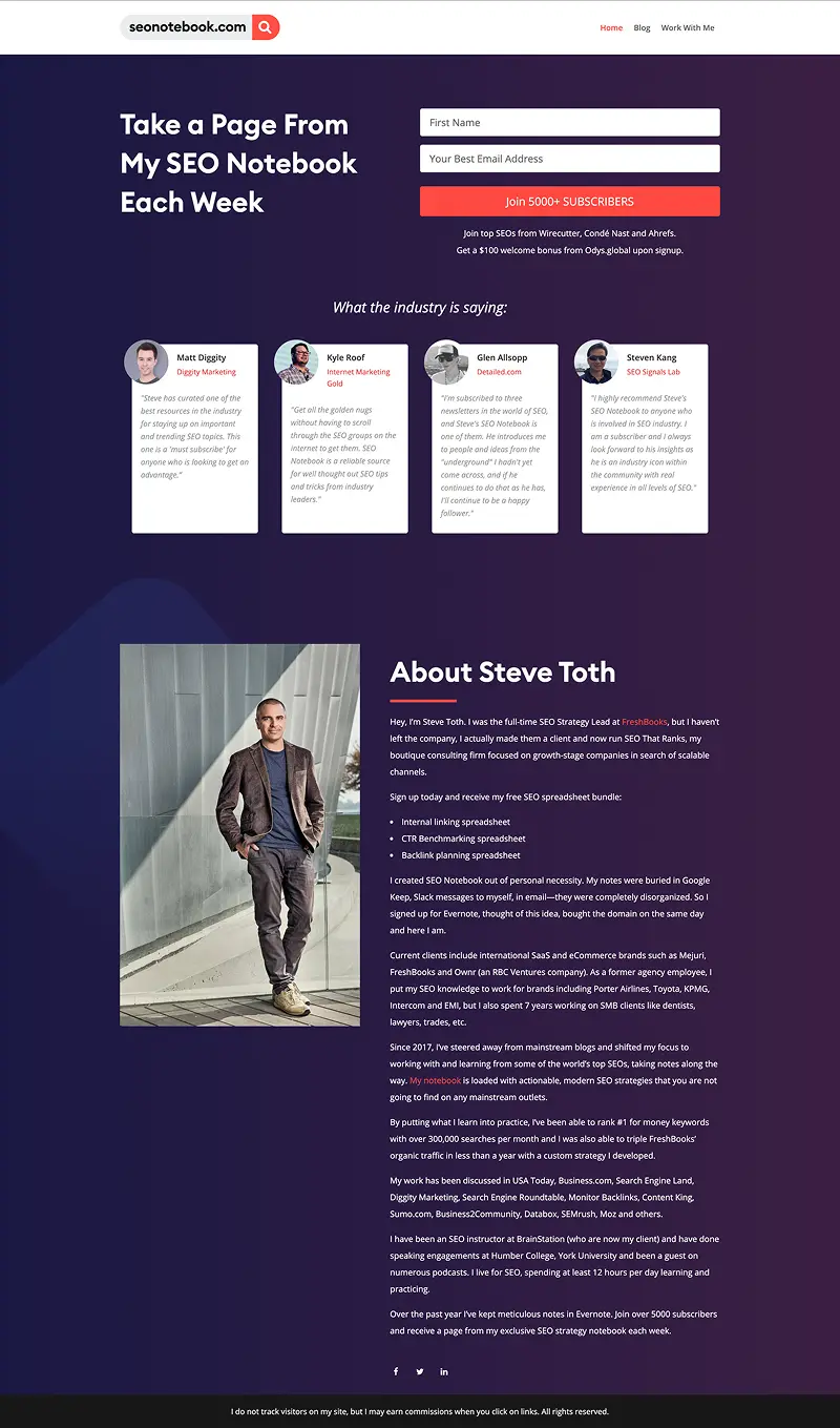
Clean, focused design driving newsletter signups — a simpler path to Steve's 15,000+ subscribers.
WEB DESIGNVISUAL DESIGN
Before After
‹›
Clean, focused design driving newsletter signups — a simpler path to Steve's 15,000+ subscribers.
SEO Notebook is a newsletter, so the site has a single job: turn a reader into a subscriber. The design had to stay clean and focused, keeping the writing central and the signup the obvious next step.
An insurance provider for high-net-worth clients needed to stand apart from commodity competitors.
A technical trading platform had to prove its sophistication before traders would subscribe.
A food service logistics company wasn't signaling the enterprise-scale operations they'd built.


